Noki Fit, in short, "Noki", is a new concept that will soon be launched into the market. It is a platform that connects both Athletes and Sports Brands together. Using Noki's "building blocks", our team tested on it with an aim to understand the target audiences' motivations and pain points, to cohesively put together the features of the platform with ease of usage. On top of that, we also introduced new features to provide an understanding of the purpose of Noki; and personalized dashboard with enhanced visual and interaction designs.
The Challenge
“With no existing benchmarks, we had to design Noki from scratch—balancing client-requested features with intuitive navigation, while ensuring the platform worked seamlessly for both athletes and sports brands.”

Wouter Delbaere
Chief Executive Officer, Noki Fit
The Process
Relying on the Double Diamond framework, our team mainly meets with the stakeholders face-to-face 3 times a week, and the rest of the daily check-ins (Scrum framework) via Zoom. We include the stakeholders to conduct research by facilitating meetings with them; we discussed about research methods, participant sizes and findings.
Assessing Current Platform
We conducted User Interviews (Methodology: In-Person & Remote) and Affinity Mapping to identify any common habits, needs and pain points of the target users striving to achieve their fitness goals, or even during the purchase of sports brands.
Research screening criteria:
User must be active in any forms of sports or fitness journey
User must have a sports brand they love, or are loyal to
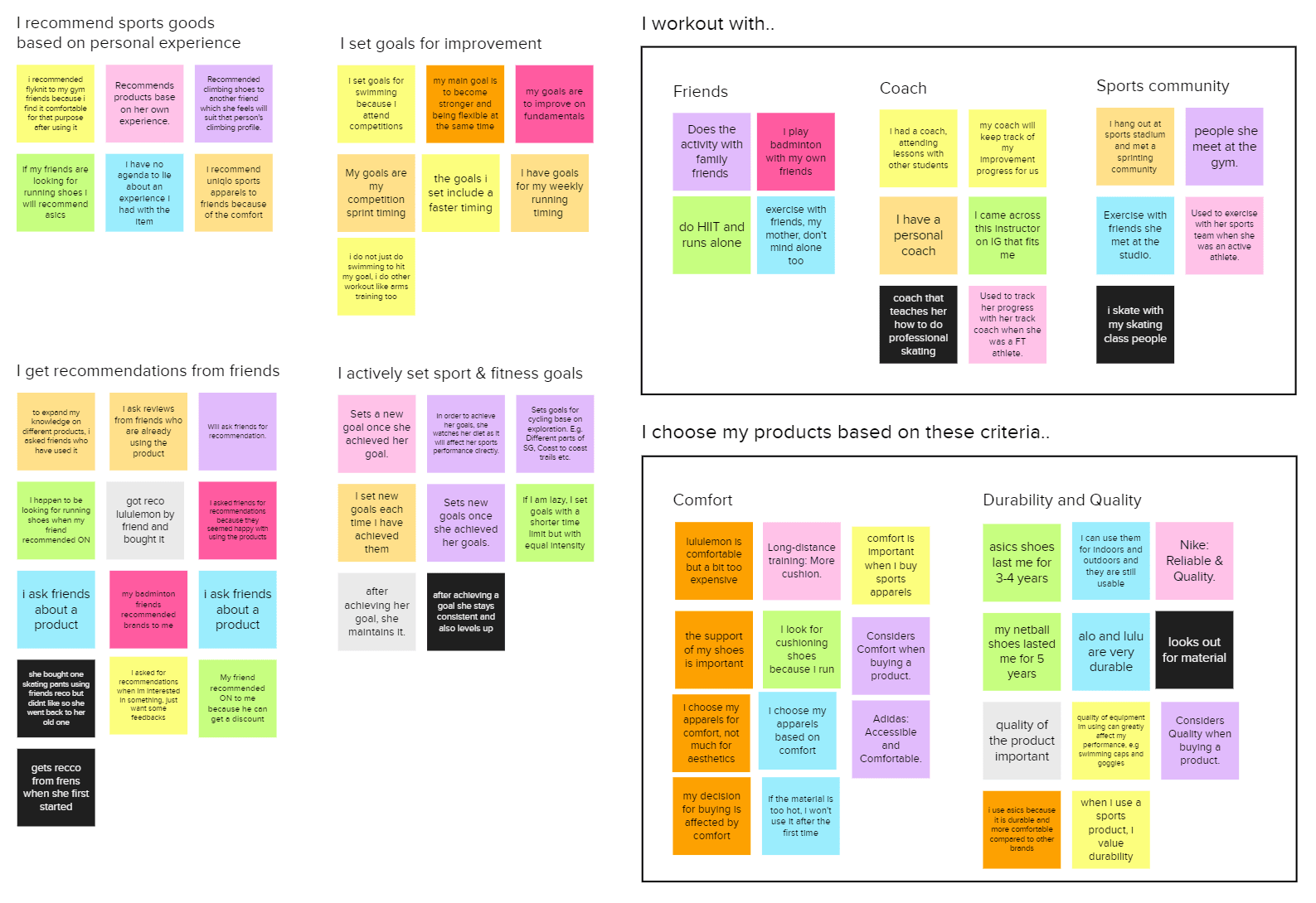
From the User Interviews with 10 participants, age 22-29, we have gathered several key insights as below.
01
Peers support is key to motivation
02
Returning to preferred brands
03
Actively sets fitness goals
04
Working out with friends & community
Auditing the Platform
Using the Jakob Nielsen's 10 Heuristics, we evaluated the current platform and rounded up to several problem areas on each platform which we focused on the ones with higher severities.
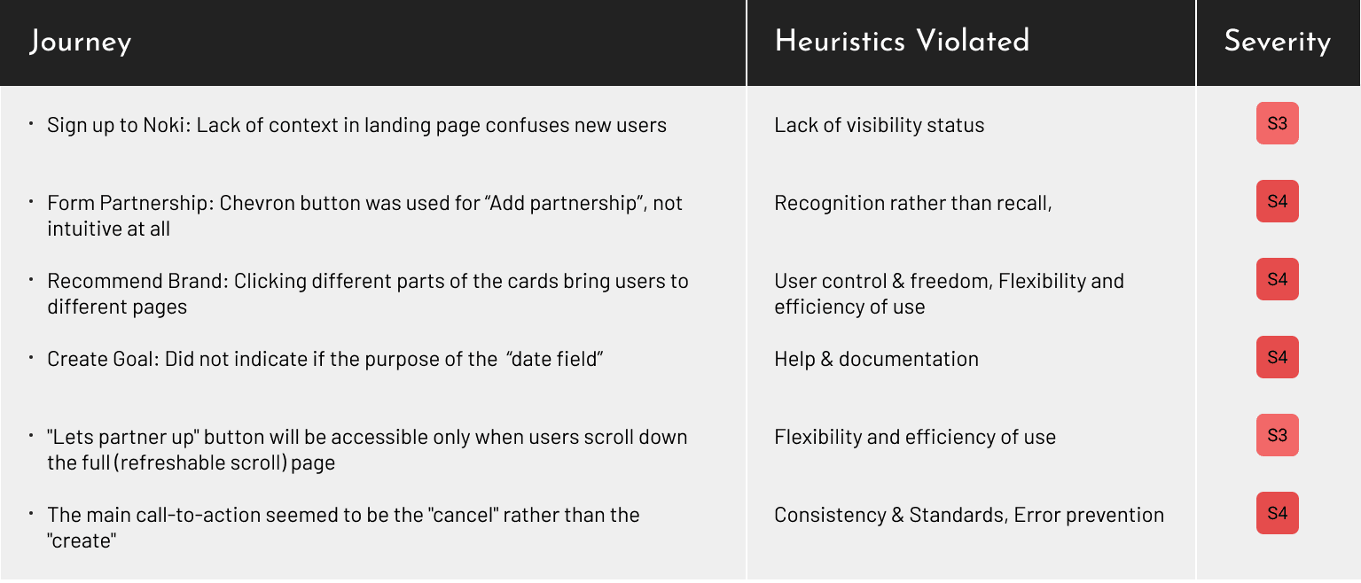
Disruptive user flow
Clicking different parts of the cards bring users to different pages. Furthermore, users tend to be brought out of Noki site, into the individual Brands' sites whenever they accidentally clicked onto any brand names.
Recommendations:
Ensuring that the entire card only lead users to 1 destination; and disallow users to be disrupted no matter what. Retaining users in Noki site is priority.
Lost in Navigation
The chevron icon is typically recognised as "expand". Not "add". Hence, it was easy for users to miss out the call-to-action, and affected the tasks negatively.
Recommendations:
Use a widely recognisable "add" button to reduce users' cognitive load. Also, arranging the features throughout the site to ensure consistency will aid in this aspect as well.
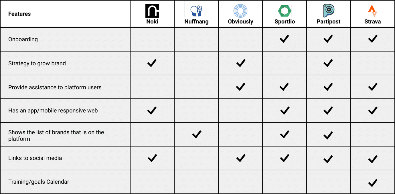
Using Feature Inventory, we conducted both Competitive & Comparative Analysis, we looked and compared the essential features that Noki's competitors has that we could learn from to implement and enhance Noki's platform to better achieve its business goals:
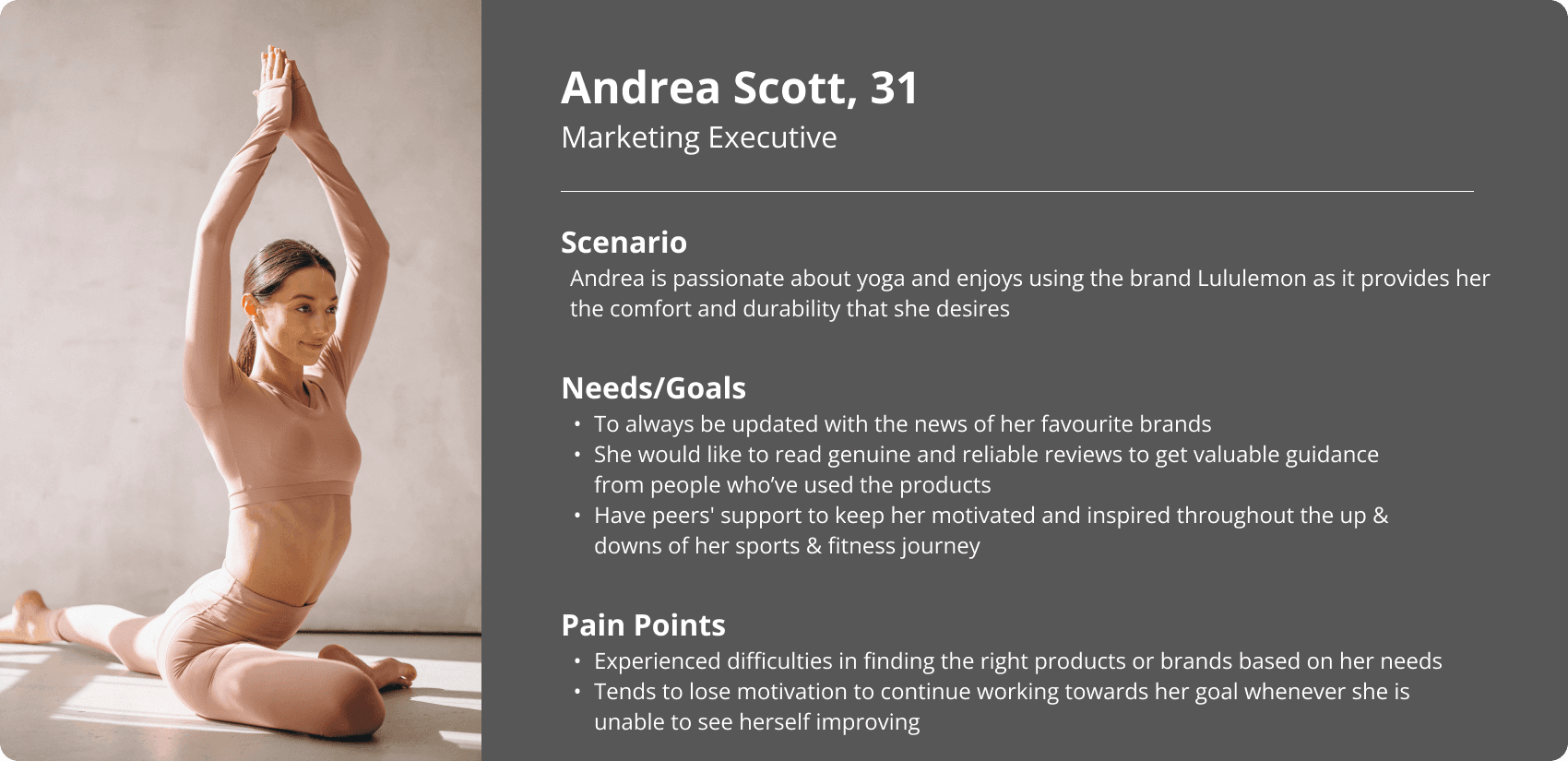
The findings that were garnered from the Discover stage informed our User Persona as well as the Customer Journey Map to develop a clear understanding of target users as well as keeping the team aligned and focused on issues that mattered.

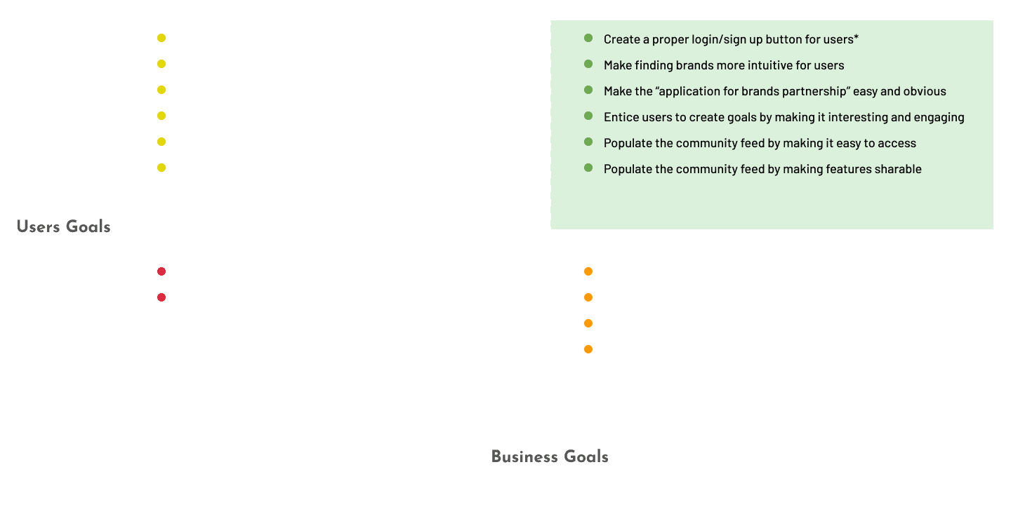
Which Features to Prioritise?
Without losing sight of the purpose of this study, we used the data from Heuristics Evaluation, User Research and Usability Tests, we prioritized features that greatly impact both Users' and Business' needs (top right section with green background). In addition, there are a few new features that we would like to implement in Prototype v1.0:
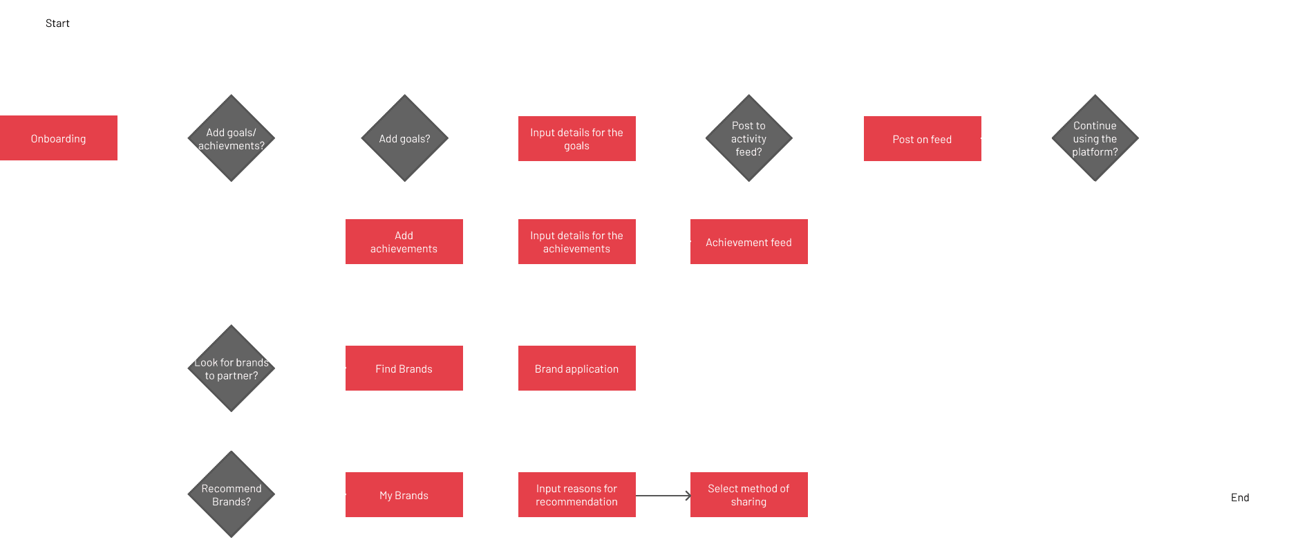
Revised User Flow
A new Site Map was created to offer a plausible and better experience for our User Persona according to her needs and challenges which translates it into our new proposed User Flow.
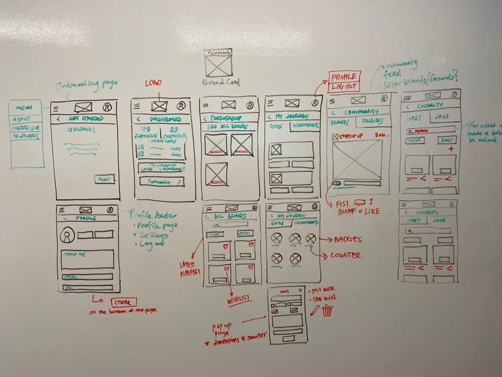
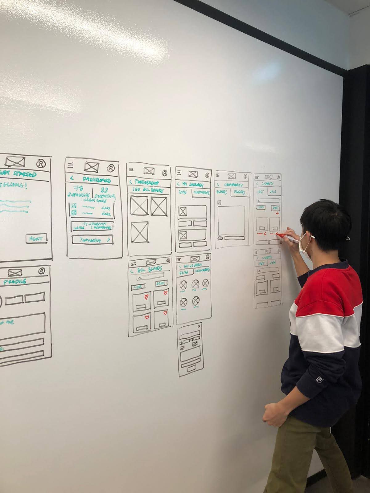
Putting the Visualisation onto the Board
Post brainstorming - the variety of Hand Sketches made it easy to quickly visualize concepts and ideas for the redesign. We then picked, combined and enhanced the ideation; put it into play as Low-Fidelity Wireframes. Since Noki is a responsive site, Mobile-First approach was used to ensure the information will be able to compressed into the smallest device to create seamless experience on any platform.
Designs Validation
2 additional Usability Tests were conducted with 8 and 10 different participants on our Interactive Prototypes v1.0 and v2.0 respectively to validate our designs.
Likes
5/8 users like the consistency of have the "Contact Us" in the footer on every page
4/8 users think that there are clear separation between Athletes and Brands sign up
Dislikes
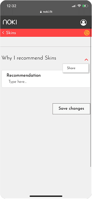
7/8 users did not know what exactly are they recommending when they click the share icon
6/8 users thought that the 'Partnership" tab could be better named to reduce confusion
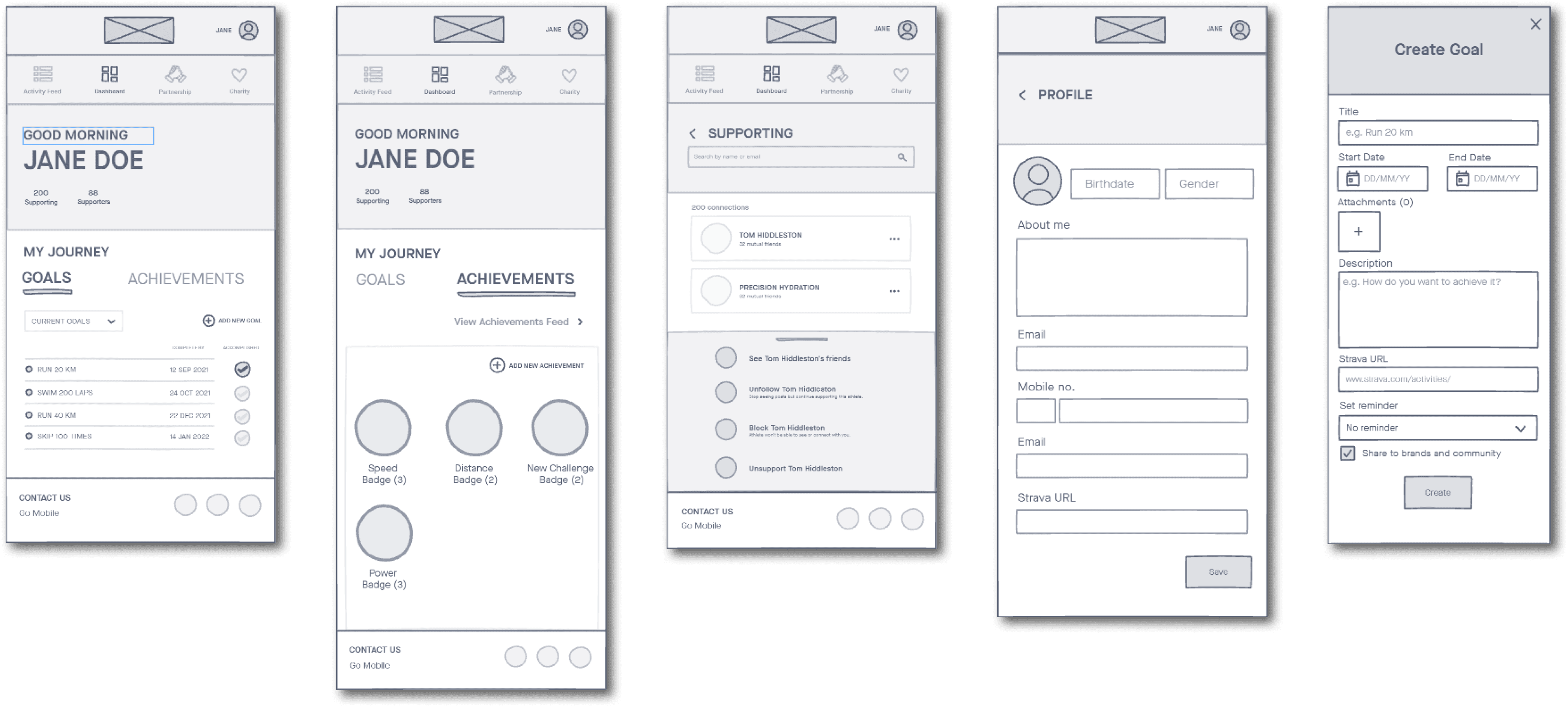
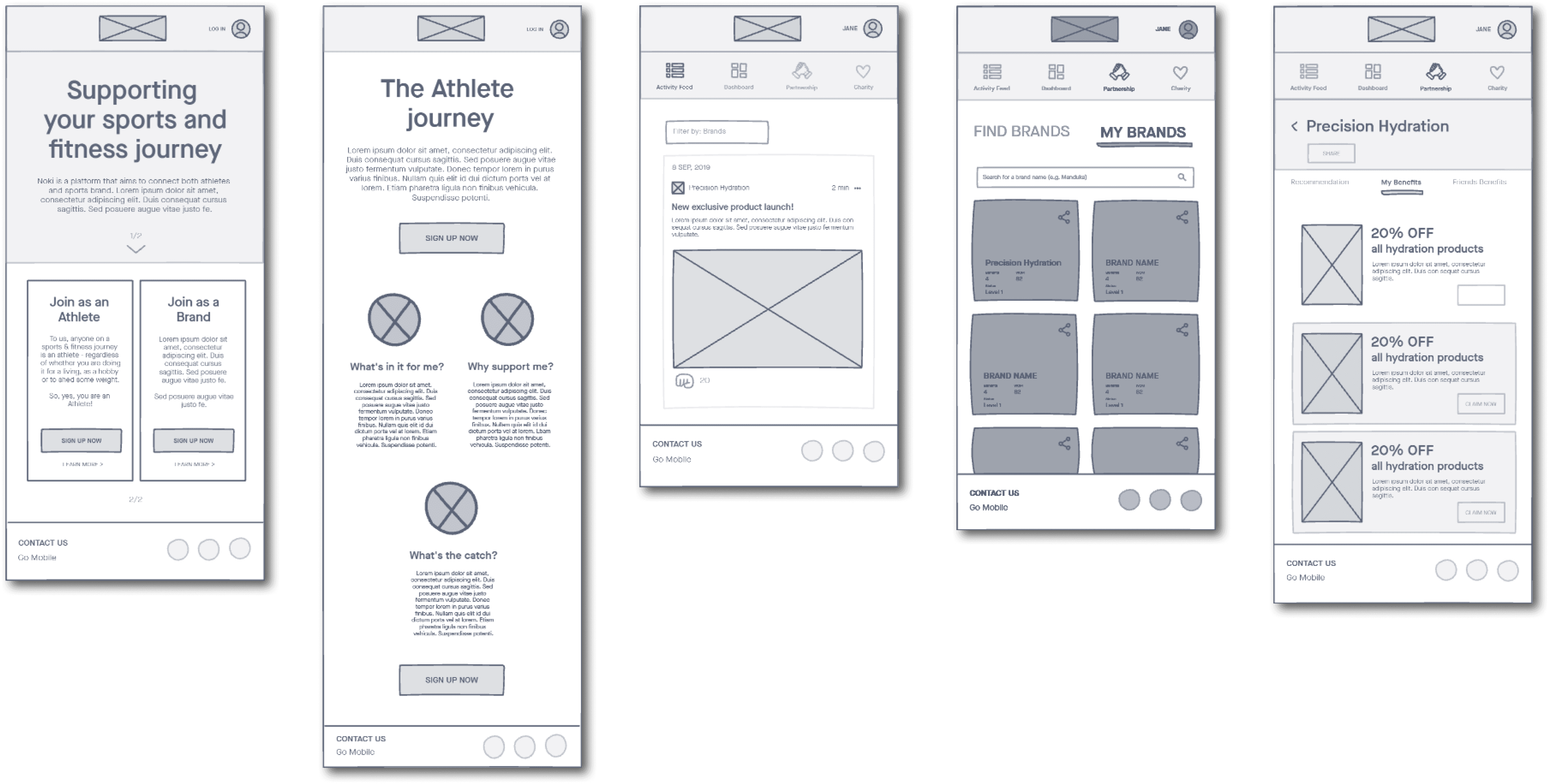
Concepts Turned into Mockup
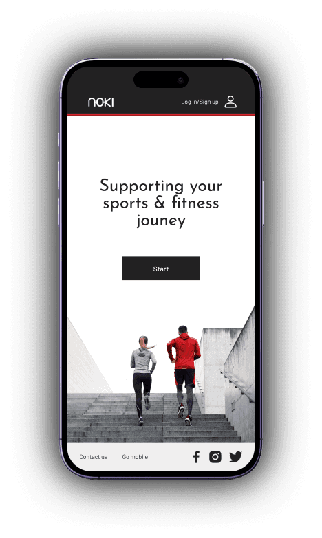
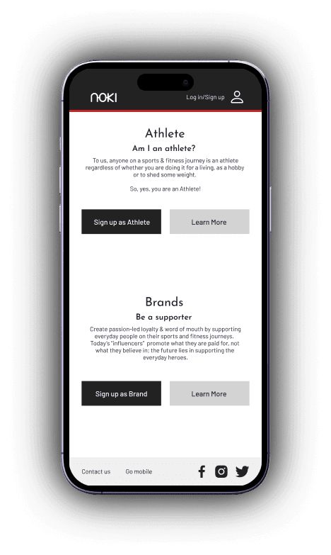
Users segmentation - this is a collaborative platform between atheletes and the sports brands.
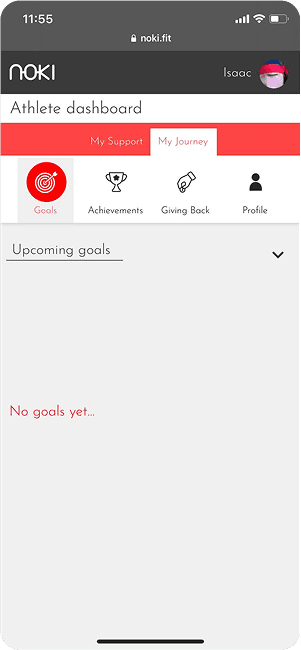
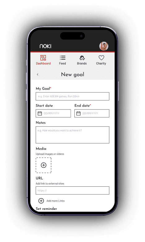
The landing greets the user with their goals and progress!

The goals are self set, users can choose whether to post them in the community (like a sports Linkedin) to increase motivation.

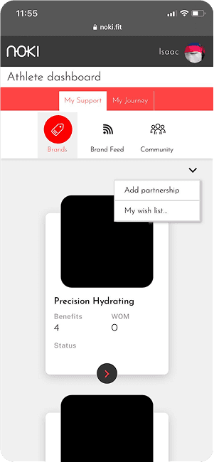
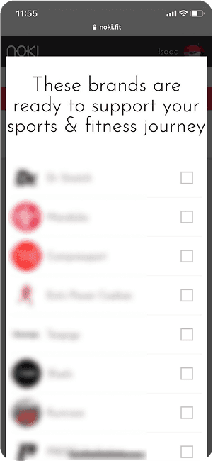
These are the participating brands that collaborates with Noki Fit, users can request for brands they love.

Due to the nature of a new business concept, users tend to doubt the motives behind certain actions, and with this lack of context, it was difficult for users to understand and complete certain tasks such as uploading images while creating a fitness goal. We documented the findings of each usability test and we can see huge improvements in the Task Success, SEQ and SUS score. Here is a summary of our findings:
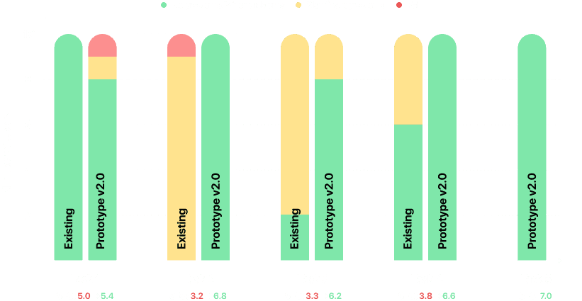
Improved task success and SEQ scores confirmed our hypothesis. By focusing on user research, simplicity, and iterative design, we met our goal—creating a platform that benefits both brands and users, driving engagement on both sides.